Project Timeline
8 Weeks
Role
Visual & Interaction Designer
Tools
Figma | Principle | Adobe Photoshop | Adobe Illustrator
About Divercity
Divercity believes that a diverse and inclusive workforce makes for a better world. It is simply a fact that diverse companies outperform their industry peers, yet the rate of diversity in the workplace continues to be appallingly low.
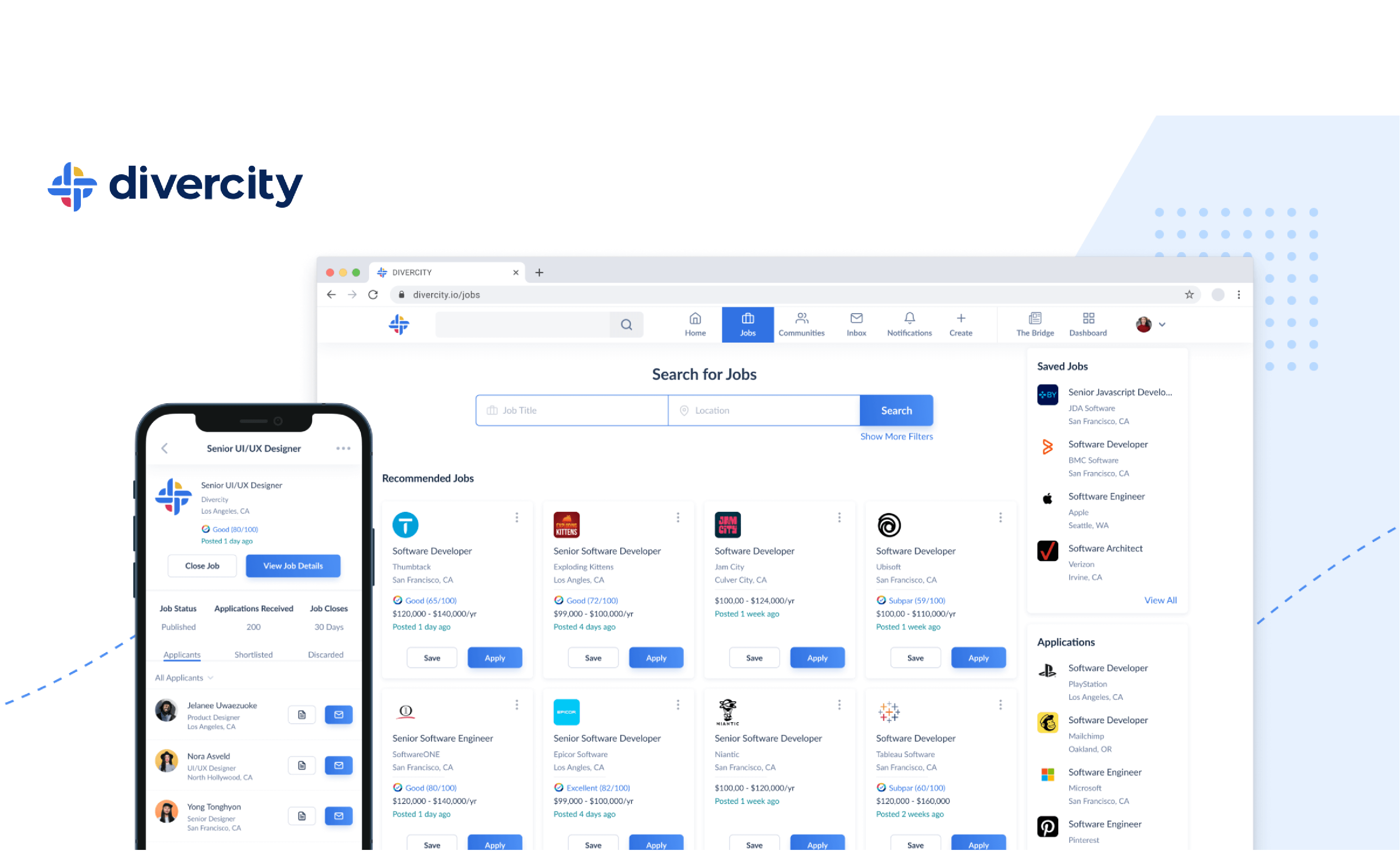
Divercity is a mobile-first job platform dedicated to building the world’s largest underrepresented professional hub. The mission is to make diversity the norm in the workplace, by connecting underrepresented professionals with one another, and with employers who are serious about building diverse teams.
Team
The team that worked on the design system, consisted of 3 designers and 4 developers, I was solely responsible for the
Why
As the Divercity team grew in 2020 , it became increasingly important to maintain a consistent style and visual language accross all areas of the product.
Foundation & Inspiration
This sytem is based largely on the principles of atomic design. The key idea behind this methodology being small, independent - atomic parts that can be combined into larger molecular structures. This foundation loosely defined our typography, colors, icons, navigation and forms.
Brand guideline & Communication
It was very important to reflect the company personality and value through the use of colors, typography and icons that represented our core values: Inclusion, diversity, equality, accessibility, empathy, community and teamwork. We reflect our values in our brand.
Disclaimer
This a summary of the elements contained in the design system as the following were excluded from this presentation such as shadows, chips/badges, mobile native navigation, tab bars, avatar illustrations, interaction-motion-design-documentation, humaanz illustration, modals and much more, while emphasis was made on the foundation elements.Logomark
Divercity’s logomark is created with the imagery of a knot, symbolizing our mission of unity and community.
Theme
Divercity’s logo consists of its logomark and wordmark. In its brand colors, it can be used on a white or light background. The logo in its light theme should be placed on any of the brand colors as the background. The logomark is used to indicate the diversity score when the enitre logo is not appropriate.
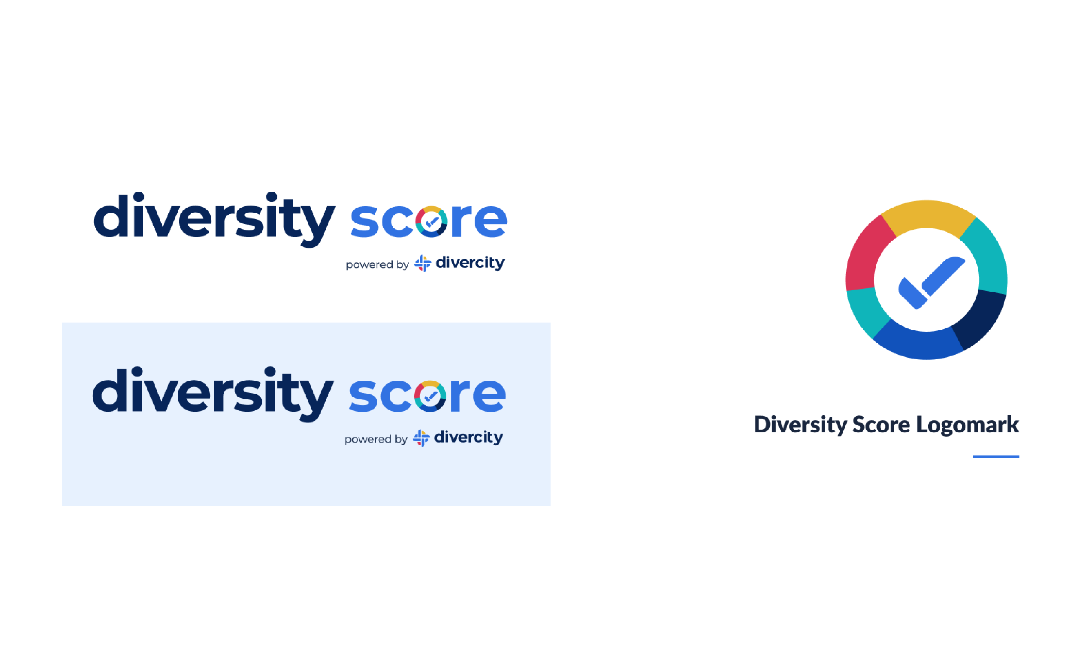
Diversity Score Brand
The Diversity Score logo consists of its logomark and wordmark. In its brand colors, it can be used on a white or light background.
Brand Patterns
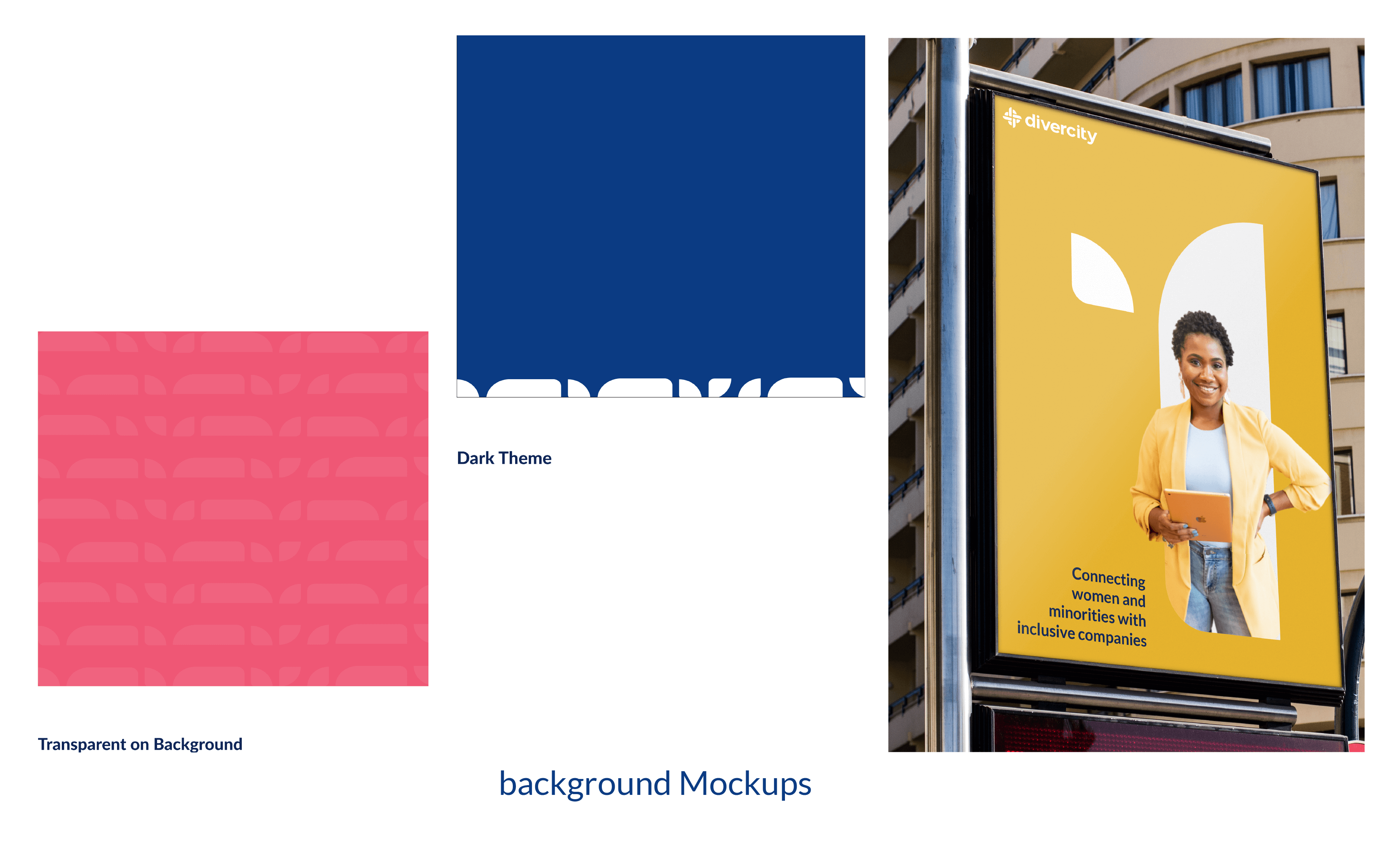
The brand patterns consist of the shapes that make up the logo, a document that contains the pattern's guiding rules was put in place
Foundational Atoms
In a user study conducted by Kushagra, it was discovered that users that have enough capital to invest, do not have enough time to research about crypto currencies, when to buy and also sell them. Let your imagination flow, imagine if there existed a suggestion feature, where experienced traders can communicate their choices which can fall mostly between each one's network such as family and friends to build trust, would aid curious investors. This would defeat exiting the app to go to external social platforms like Facebook, whatsApp, which are not designed for such operation. Have a look at this featue;
Grid
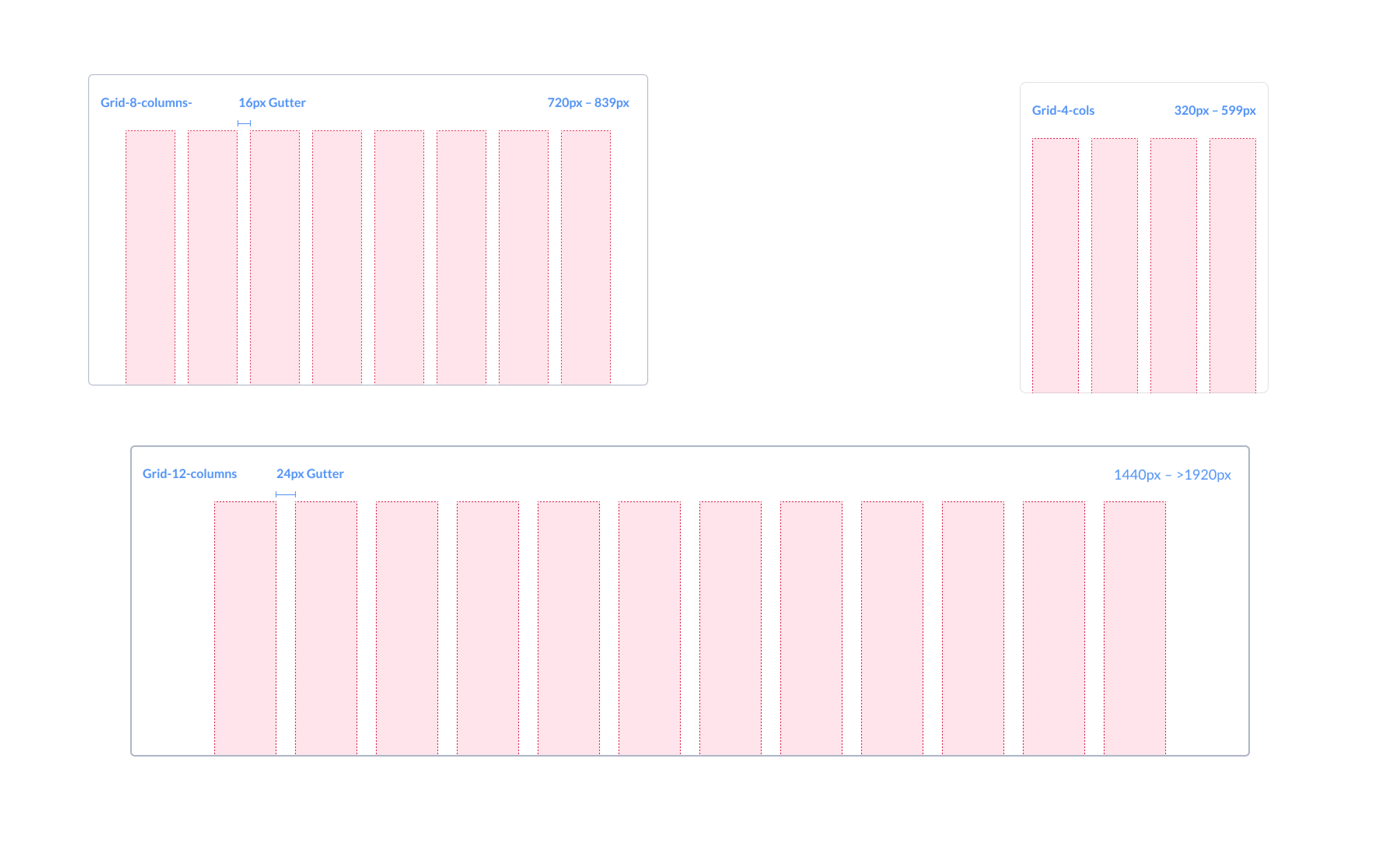
The 8pt grid system to space out the elements on a page. This means that any defined height, width, margin or padding will be an increment of 8.
Color Palette
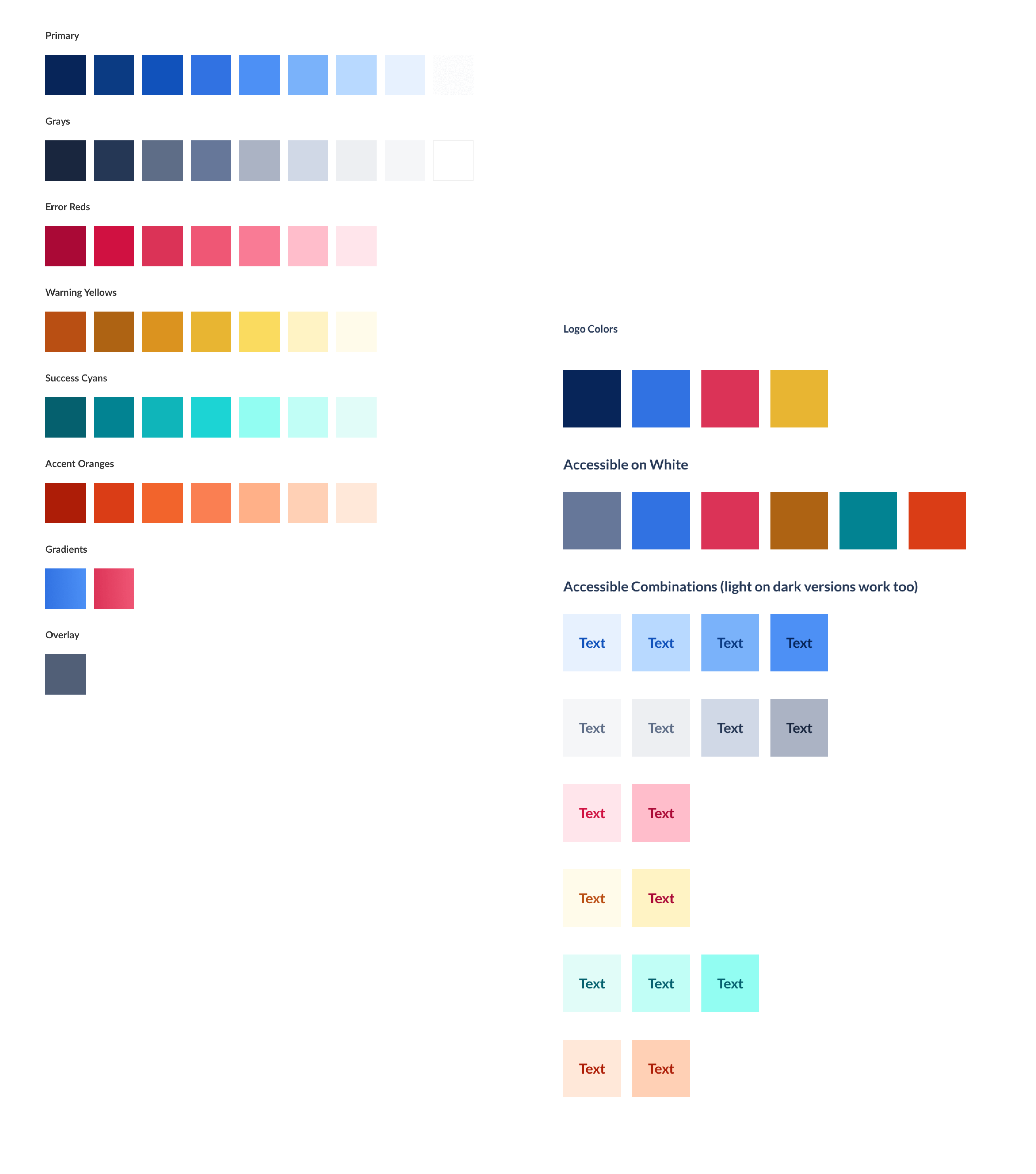
The primary palette is compromised of blues, nuetrals and accent colors. They are also committed to comply with AA standard ratios
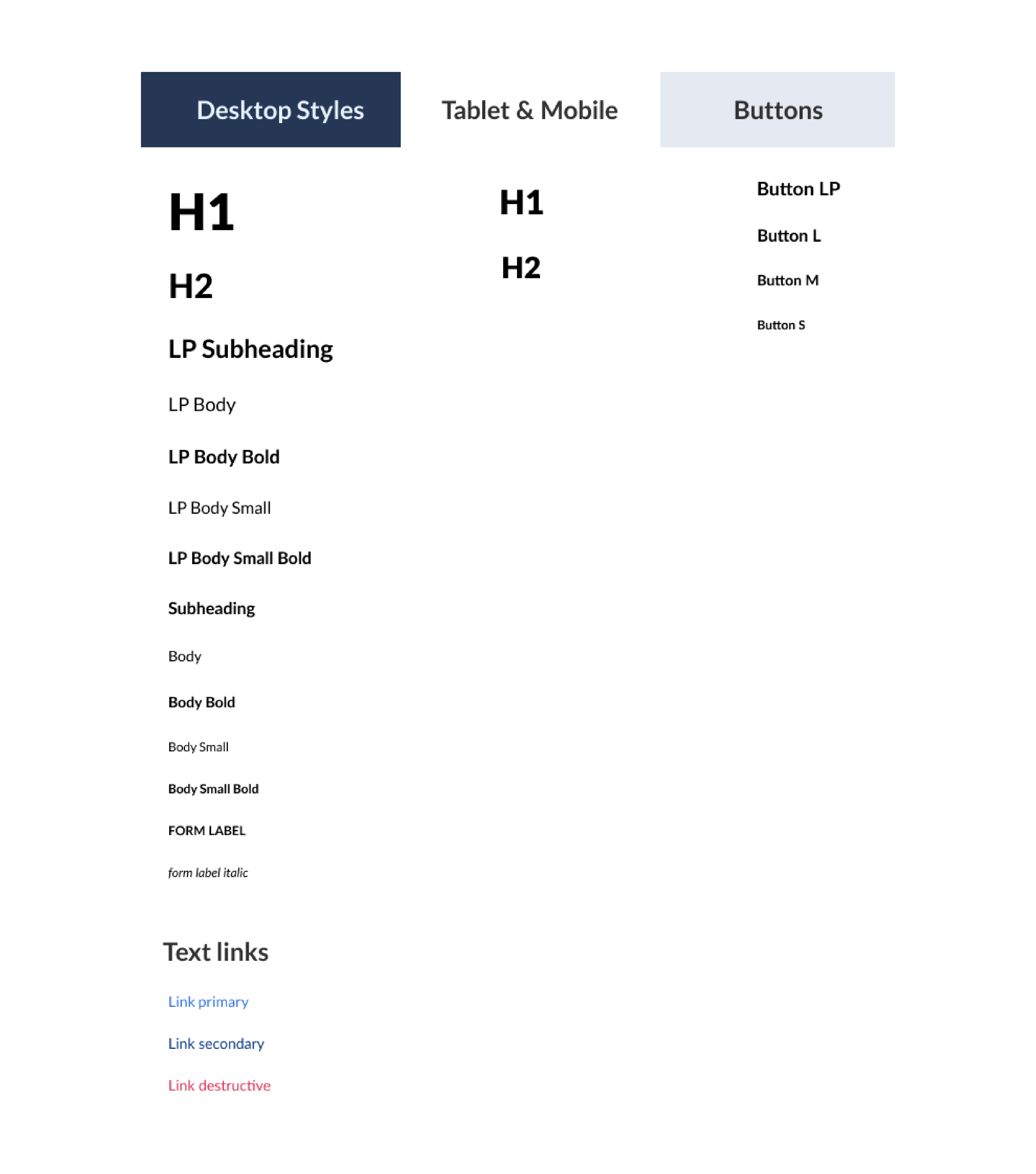
Typography
We almost exclusively use Lato as the base typeface accross the entire Divercity products and Montserrat for our Logo.
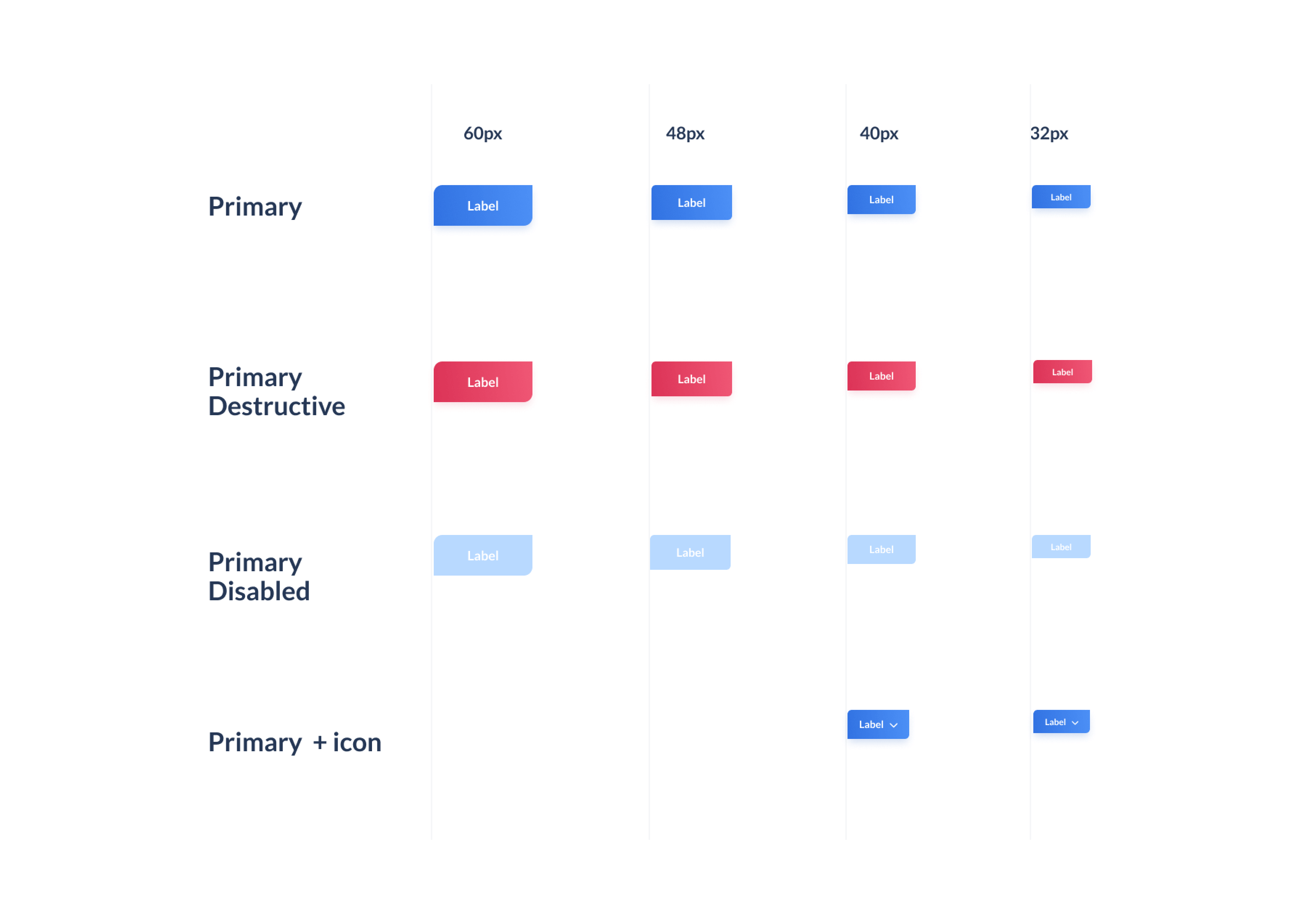
Buttons
We almost exclusively use Lato as the base typeface accross the entire Divercity products and Montserrat for our Logo.
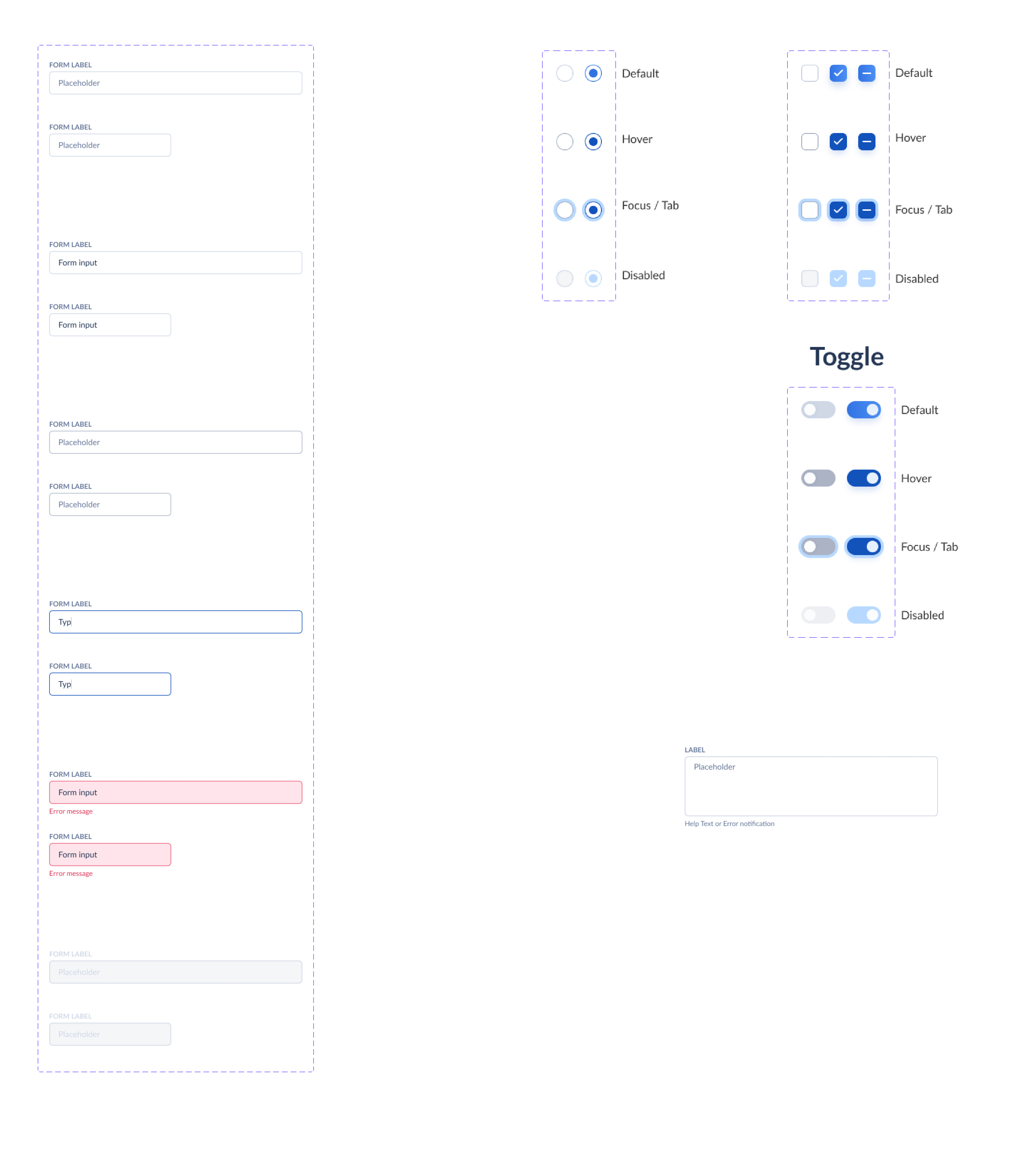
Forms
We almost exclusively use Lato as the base typeface accross the entire Divercity products and Montserrat for our Logo.
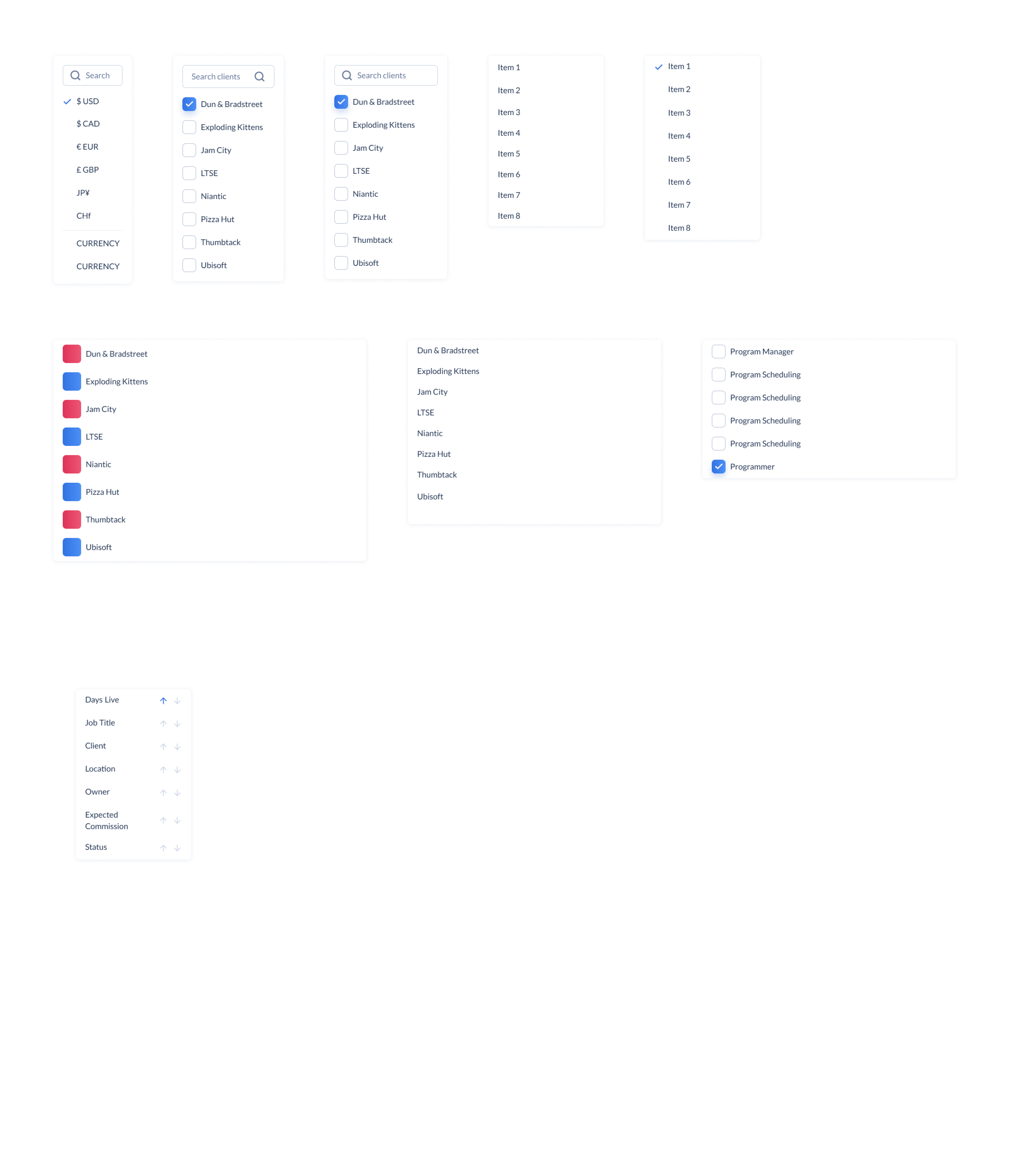
Filters
We almost exclusively use Lato as the base typeface accross the entire Divercity products and Montserrat for our Logo.
Icons
We almost exclusively use Lato as the base typeface accross the entire Divercity products and Montserrat for our Logo.
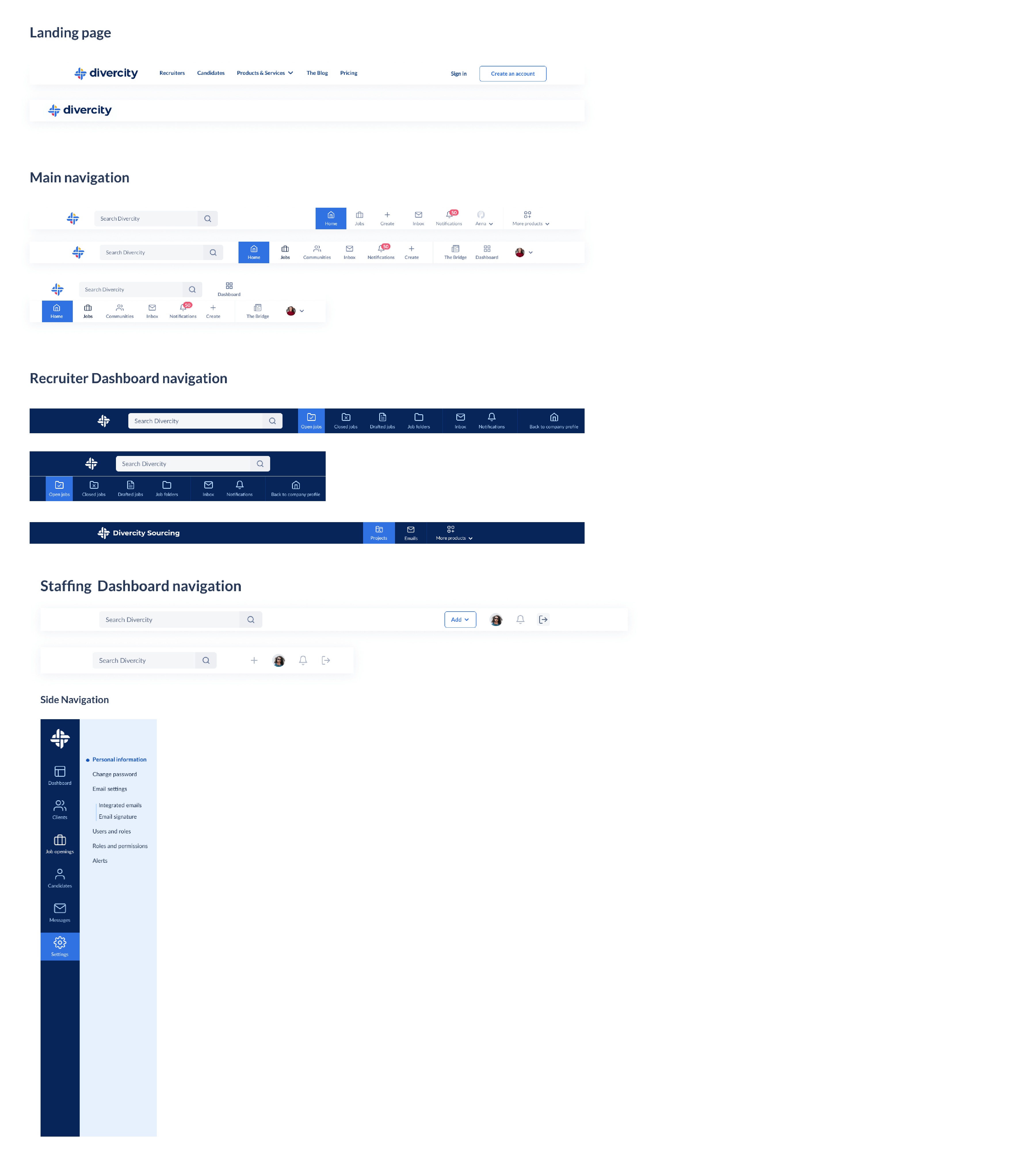
Navigation
We almost exclusively use Lato as the base typeface accross the entire Divercity products and Montserrat for our Logo.
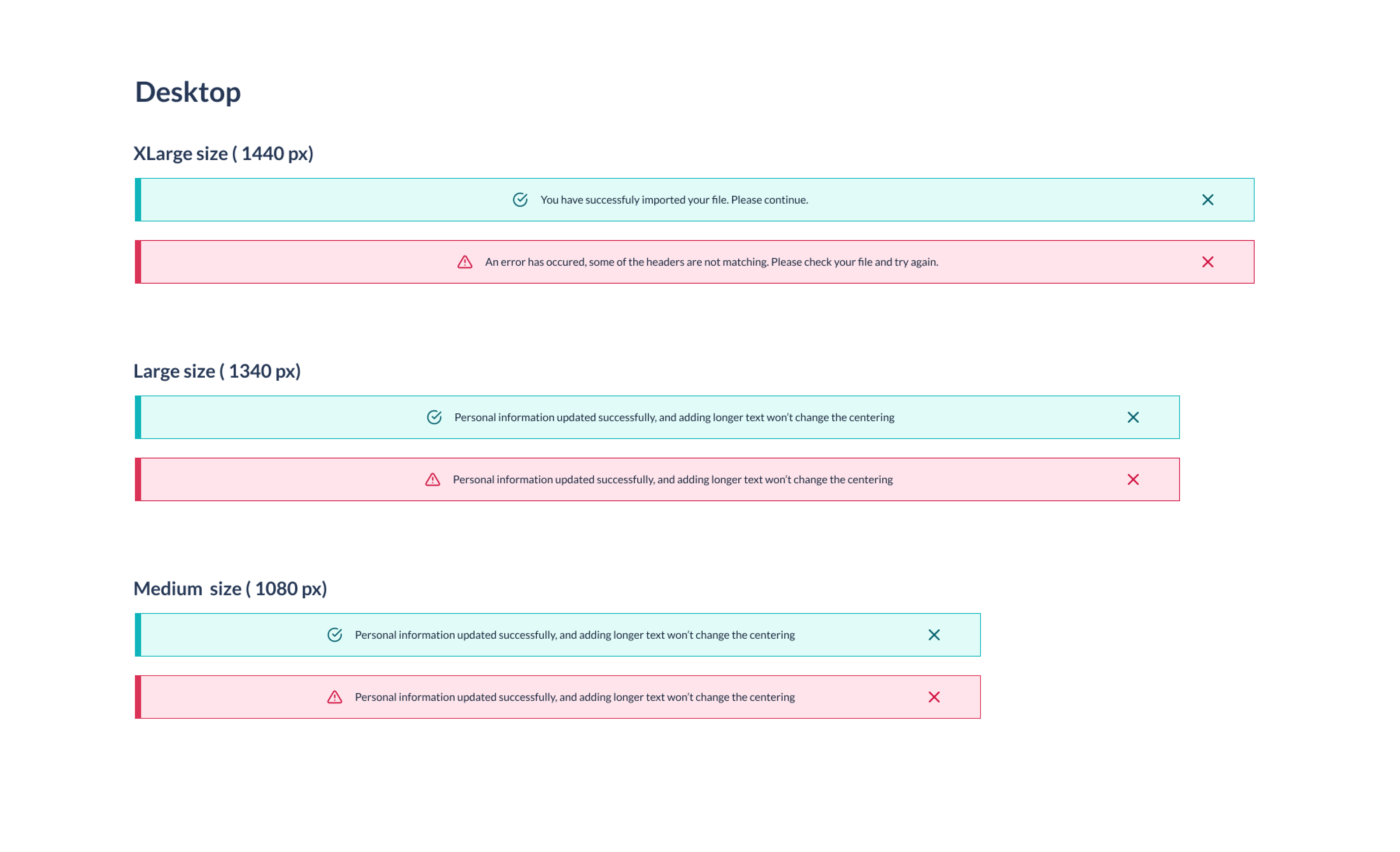
Inline Notification
We almost exclusively use Lato as the base typeface accross the entire Divercity products and Montserrat for our Logo.
Learnings & Conclusion
Numerous hours of brainstorming careful planning, sketching, designing and developing has brought the results desired for the Divercity platform. We were proud to present the new face of the product to our stakeholders. The final result of the design system was used to designed the latest face of Divercity. The new feed page is more organize, with a harmonious color palette and more intuitive for our users.
